The design of your online store allows you to show off your brand personality and create a unique offering. Your design should stand out, be instantly recognisable and convey your brand messaging almost instantly. But optimising some of the website design can improve more than just your brand offering.
By making small changes within the fundamental design elements can affect your conversion rate and user journey. Both of which are extremely important metrics to optimise if you’re serious about running an eCommerce store.
In this article we’re going to look at some conversion rate design tips and discuss some basic UI and UX design tricks to improve your conversion rate. Improving the user journey through clever web design tricks will create trust, loyalty and increased conversions.
-
Hicks Law
Hicks law states that a customer who has more choice will take longer over making a decision. An obvious hypothesis. But in eCommerce, speed is everything. The longer a customer takes to add to the cart and checkout, the less likely they are to complete a purchase.
There was a famous experiment involving 2 different jam options in a supermarket. The first stand had 24 different jam flavours and the second stand had only six.
60% of the people walking past the stand with 24 jams on stopped and sampled the jam, but only 3% of those actually purchased a pot. On the stand with only six flavours, 40% of people stopped but almost 30% of them purchased.
The reason why people were less likely to buy from the 24 flavoured jam stand is because they’re likely getting overwhelmed with choice. Having only 6 flavours means that the consumer is able to differentiate from the best flavour easier, and therefore is more likely to make a purchase.
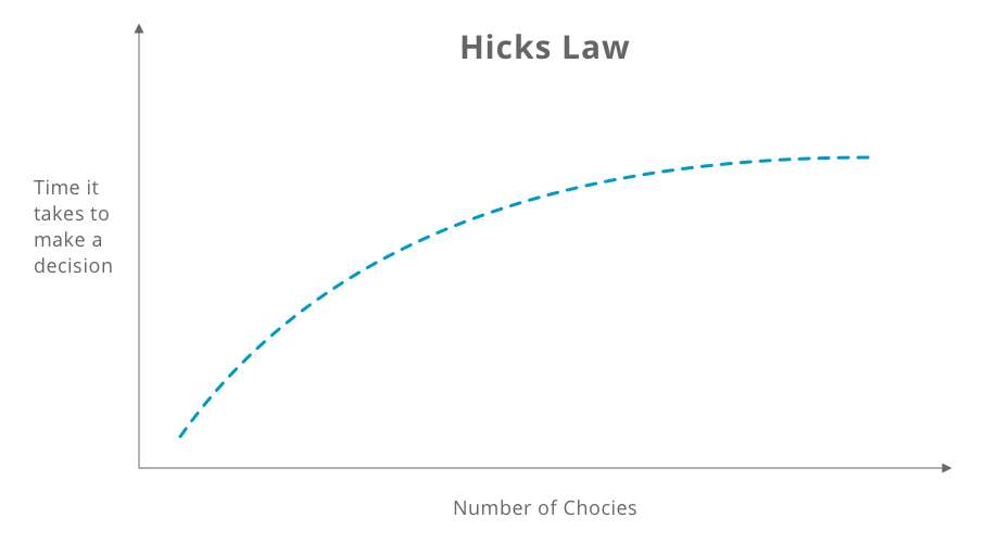
We can use this principle within web design to improve the conversion rate. There are numerous places where this can be applied, but the important rule to remember is; keep it simple, less is more.
- Navigation
Do you need all your navigation items. Especially on mobile when the real estate can be limited, it’s important to streamline your navigation. Removing items that might not be relevant will help make a cleaner, less confusing navigation. This will help your customers find what they need straight away and not be daunted by the amount of choices.
- Product Options
If you have lots of different variants, be that colours, patterns, finishes or sizes, try to keep them as simple as possible. Look through your previous orders and find the variants that are the most popular and remove the others. Doing this will help your customers make a decision quicker and less likely to be overwhelmed by choice.
- Similar ProductsWhile cross-sells and upsells can help the user find exactly what they’re after, it’s important that you don’t have too many options. Ideally you’ll want to offer 3 or 4 cross-sells on the product page. Offering upsells after the user has added the product to the cart means that they’re not interfering with the initial purchasing thought process.
- Navigation
-
Negative Space
If you want a customer to perform and action be it; sign up to an email list, watch a video or add a product to cart then you need to make that action obvious. One way of achieving this is by adding an appropriate amount of white space to a page to make key features stand out.
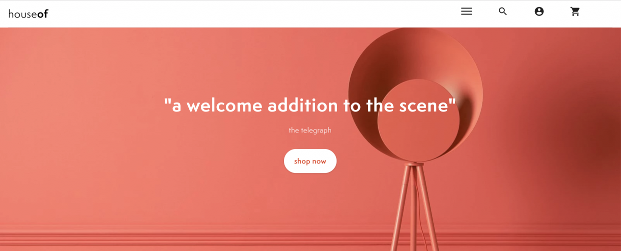
HouseOf.com use whitespace to make the CTAs as obvious and clutter-free as possible
Similar to Hicks Law, keeping design elements simple, easy to differentiate and obvious will help guide the user through to the call to action button of your choice. This can help you map out a full user journey and buying process through your site. Optimising this can be extremely powerful and should be implemented throughout the site.
- Landing Pages
The home page and other landing pages should show obvious intent on where you want users to go after arrive. Having a single CTA surrounded by white space will draw the user’s eye straight to where it matters and you can drive the user to product or collection pages.
- Product Pages
While it’s really tempting to try and cram as much of the product details in above the fold as possible. It’s actually more important to allow the design elements of the product page to breathe. Make sure there is enough white space around the “add to basket” button and that it’s obvious and eye-catching.
- Shopping Cart
Pushing users into the checkout from the shopping cart is one of the final parts of the purchasing journey. It’s important that the checkout CTA is obvious and surrounded by white space, as this could have a large impact on conversion rate.
- Landing Pages
-
Design Proposition Drivers
Proposition drivers explain to customers why they should purchase your products or services over your competitors. By designing these prop drivers you can convert more of your website visitors into customers. Similar to USPs, prop drivers are used to promote the unique delivery of your service rather than the product itself.
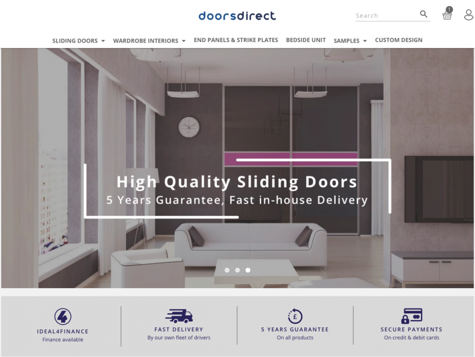
DoorsDirect use Proposition Drivers throughout their site and email marketing to differentiate themselves from their competitors.
Free shipping, free returns and pay in 3 are all examples of conversion driving proposition drivers. Use UI icons and have them available on most of your pages so that the customer can process the proposition drivers quickly. When used correctly, this can have a huge effect on your conversion rate.
Once you’ve settled on your proposition drivers and the design of them, you can use them throughout your marketing. Including them in email marketing flows, campaigns and even social media will help create a consistency around your unique offering.
-
Use Real People
Using real people in your lifestyle photography can massively improve the look and feel of the product page. By understanding your target audiences, you can create a lifestyle, persona and scenes in the photography that will make your customers relate and create a sense of FOMO. This can invoke some powerful physiological effects on consumers and help improve the conversion rate.
Using lifestyle images of real people on the product page can help improve the amount of adding to carts, but you can also use people throughout the site to improve other CTRs and conversion values.
- Landing Pages
You can actually use of people to guide the user to the right CTA. It’s well known that having an image of a person that’s looking at a CTA or a headline will improve the amount of users that pay attention and ultimate convert. It’s a basic instinct to look at where someone else is looking. Using this in web design can have a powerful impact on your CTRs and conversions.
- Emotional Response
Different images of different people can encourage an emotional response. Emotions can create better connections to products than a functional or logical reason. So evoking an emotional response can encourage better engagements and conversions.
Using a headshot of a customer service agent next to the contact CTAs can encourage more phone calls and emails. You can also use images of someone relaxing and reading an article to encourage more people to sign up to your newsletters. While these may only have a small impact, over time it could be a large contributor to your overage CRO strategy.
- Landing Pages
-
Invest in Quality Photos
When you go to shop, you can see the product with your own eyes, you can pick it up, feel it and even smell it. Online you lose all of your senses, except for sight. This means that you need to create imagery that can compensate for the lack of other senses.
Having images where you can clearly see every detail of the product can help improve the conversion rates on the site. But there is much more to create quality images than just better resolutions.
- Clear Background
Removing the background or having a plain white background shows your product in a non-distracting environment. As mentioned previously, negative space around an item makes it more attractive and eye-catching.
- More Than One Angle
As a minimum you need to have a picture of the front, back and sides of your product. The user doesn’t know what your product looks like, so giving them different angles to view it from will help them make an informed decision.
- Zoom
Having a zoom function on your site will let the user inspect important elements of your product in better detail. A lot of Shopify themes come preloaded with a product zoom, but if yours doesn’t have one, it can be added with relative ease.
- Clear Background
-
Design a Unique CTA
While it’s important to optimise the design of your site to increase CTRs and conversions, it’s really important that you optimise the design of your call to actions. Making your call to actions as enticing as possible using text, colours, design and placement will ultimately increase your conversion rates.
- Colour Psychology
The colour of your button matters. Depending on what you want the user to do, what your brand is like and the surrounding design is, you may want to test different button colours to see if it improves or hinders your CTAs.
- Text Optimisation
“Add to basket” or event “click here” are really bad examples of CTAs. While they should be kept clean and easy, there is room for a bit of creative content writing. Adding adjectives such as “explore” can encourage users to click through on the CTAs.
- Animations
Subtle animations can draw the users eye towards the call to actions. Even subtle hover animations can help convince the user to click on the link. Again, this is dictating the user’s journey and can improve your overall conversion values.
- Colour Psychology
-
Design Your UGC
We know that user generated content and social proof can improve your brands trust, loyalty and conversion rates. But designing your UGC for better placement can improve your conversion rates further. By including your UGC on the product page, you’re showing off the lifestyle that your brand brings to your consumers. This can create a powerful, emotional response that can cause your users to add more to the cart and improve conversion rates.
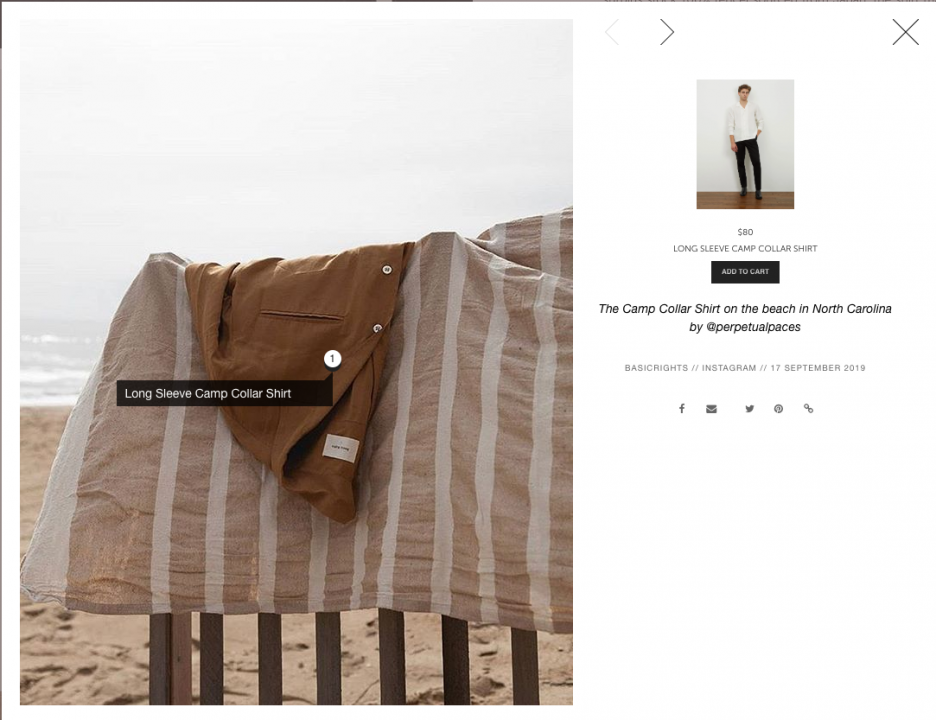
Basic Rights use custom designed UGC to allow customers shop their instagram on their site.
While UGC should definitely be used on the product pages, using it landing pages can help guide the user journey. Design the UGC into your collection pages to showcase not just your product but the lifestyle of your product, from real people.
-
Optimise the Design of the On-Site Search
On site search can help your users find the ideal product better and faster than navigation. Optimising the functionality of it is important, but optimising the design of it is just as important. Making the on-site search accessible, on both mobile and desktop will encourage more users to use it. Including subtle animations into the search will make it more engaging and encourage more interaction.
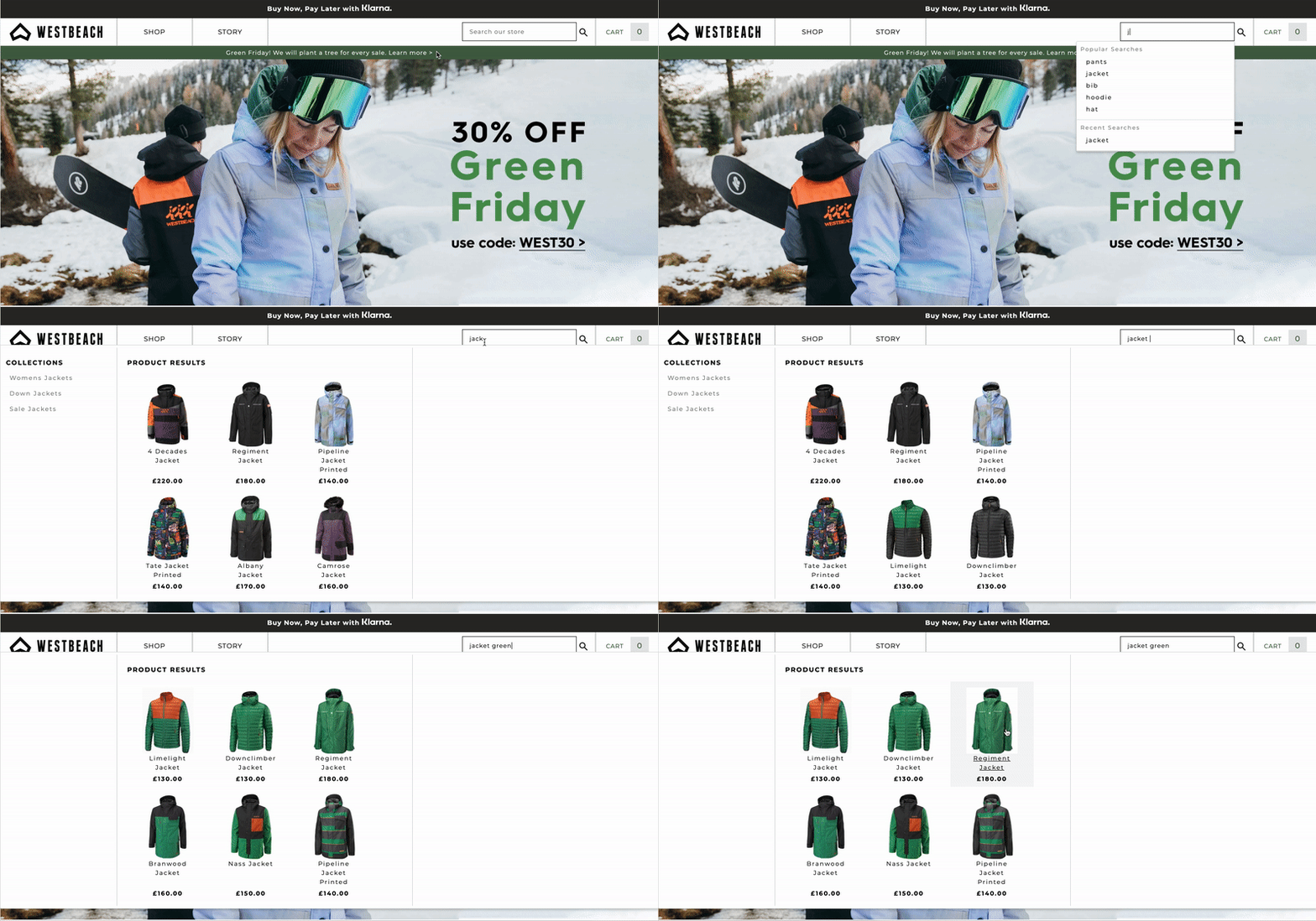
Westbeach have designed their on-site search to be more engaging and improve the user journey.
Designing for conversions is all about making the user journey more enjoyable and as frictionless as possible. Our team of developers and marketing analysts can work with your brand to help improve conversion values by making small but noticeable changes to the design of your site. Get in touch to find out more.
Follow me on my travels!


